How they made an impact. A short selection of significant prints from the “History of Press Graphics. 1819-1921”
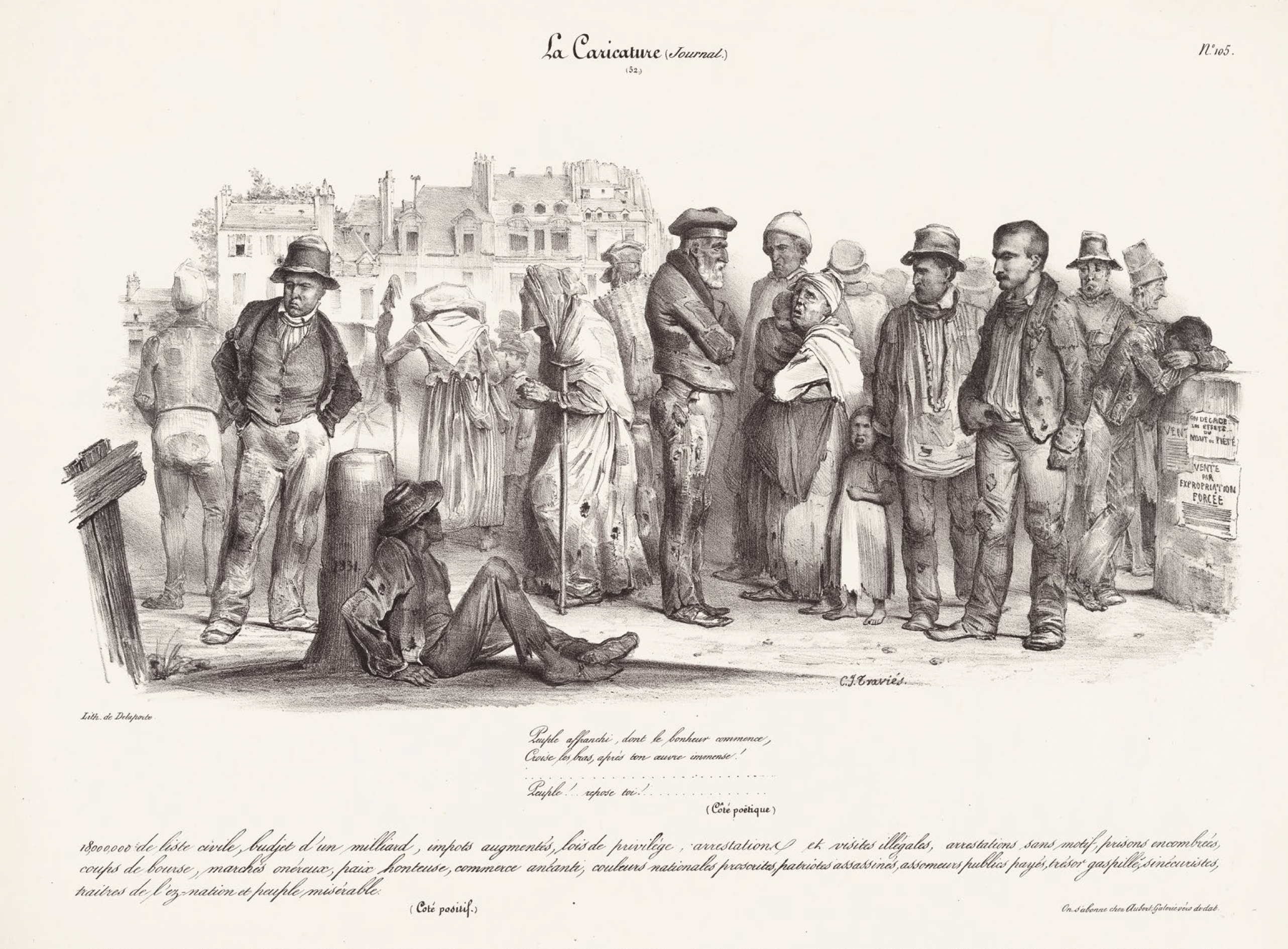
Charles-Joseph Traviès & Michel Delaporte (lith.): Peuple affranchi, dont le Bonheur commence… (Liberated People, whose Good Fortune Begins…), From: La Caricature, Paris, 27 October 1831
What sails here under the flag of caricature is nothing other than an early form of blunt and bleak social realism. The group makes a powerful and monumental impression, misery in the dimension of a history picture, and that’s exactly how it was meant to be. The publisher of La Caricature, Charles Philipon, like most of his illustrators, was trained in a school of Napoleonic history painting and propagated press graphics as a critical and accelerated mode of history art.
To do justice to the significance of such a graphic, it would have to be hung in the Louvre next to Courbet’s “Burial at Ornans”, the central icon of Realism, which, however, was only created some 20 years later. The illustrator Travies may have known examples of the baroque social realism of the Le Nain brothers, but this new kind of miserabilism served a political campaign that was to shake the foundations of the July monarchy in the long run. Of course, the issue was banned, as were many other editions of La Caricature.
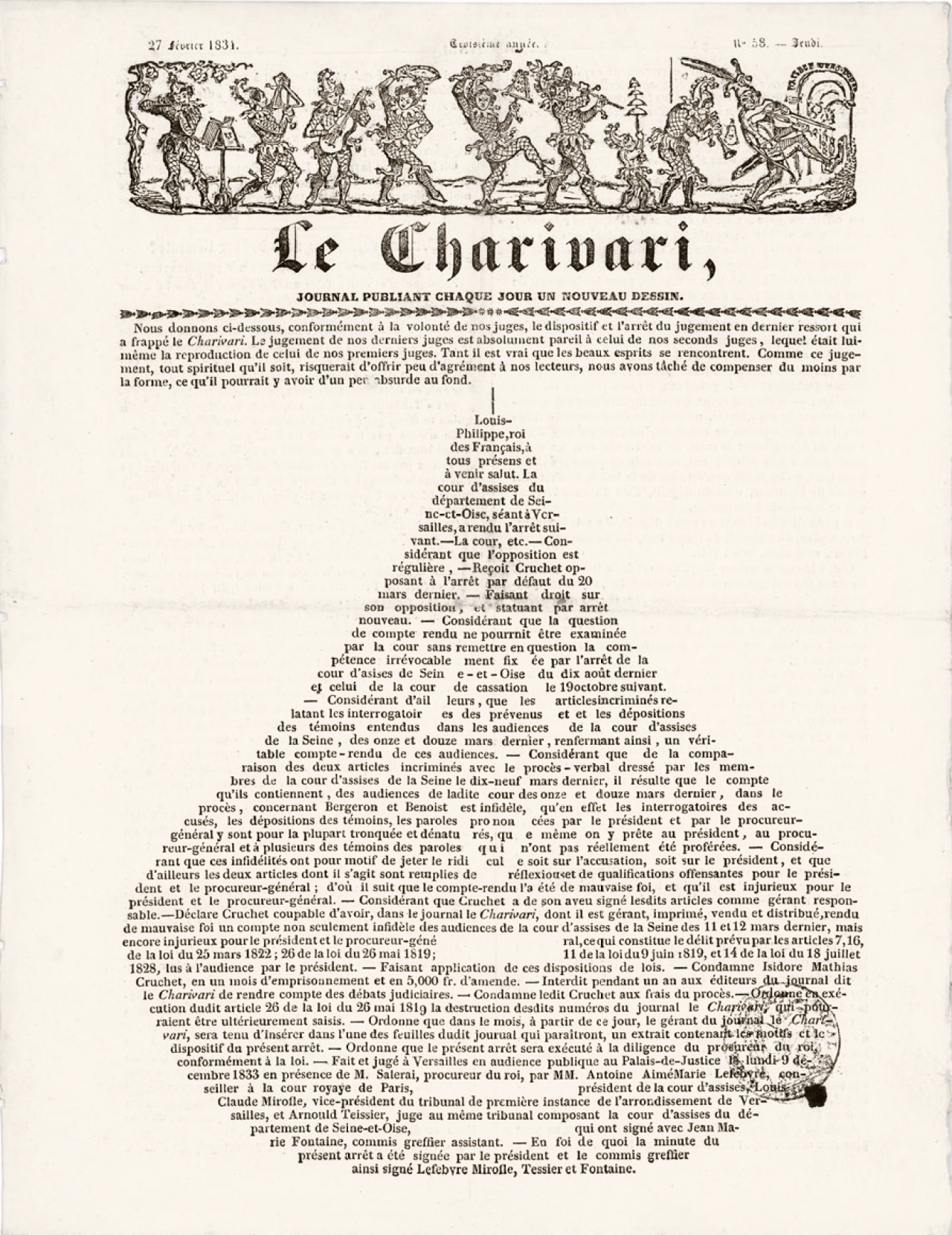
Charles Philipon: Louis-Philippe, Roi des Français, Aus: Le Charivari, 27 February 1834
For this catchy typographic pear, Philipon was not only responsible as a publisher but also as an author. In French slang, the pear signified a moron. In the course of his campaign against the July monarchy, Philipon managed, through a series of cartoons and a sensational court case, to impose this fruit as a symbol for King Louis Philippe and his morose government. For a while, it was ubiquitous as grafitti, not only on Paris buildings, but also in the provinces.
The typographic realisation represents an early example of how the censor´s bans on images provoked the creation of adventurous, abstract imagery.
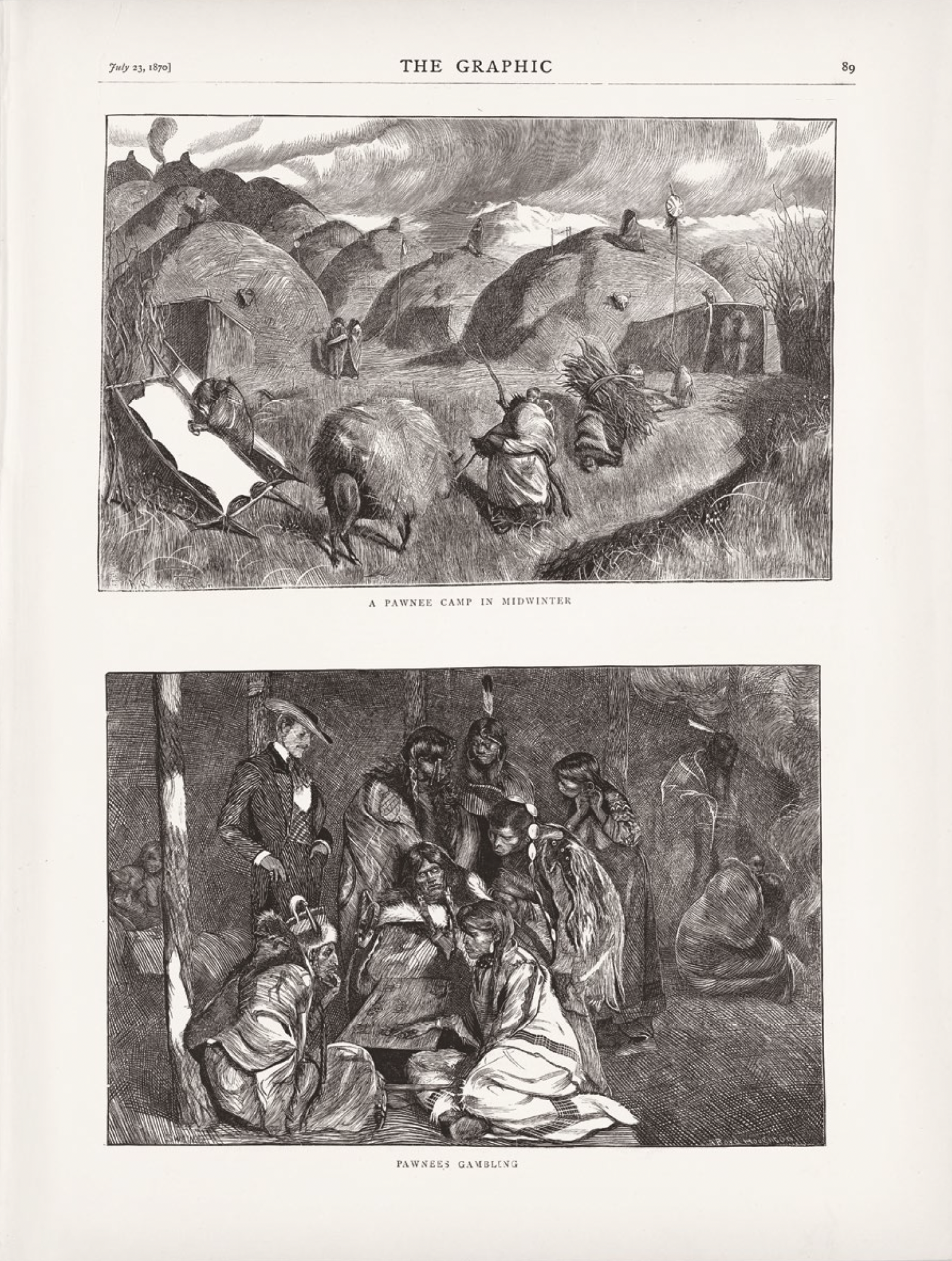
Arthur Boyd-Houghton: Graphic America: A Pawnee Camp in Midwinter/Pawnees Gambling, Aus: The Graphic, London, 23 July 1870
A page from the multi-part travel reportage “Graphic America” by the graphic reporter and genre painter Arthur Boyd-Houghton, which appeared over a period of almost three years in the British illustrated magazine The Graphic, of interest not only because of the Anglo-Indian artist’s unconventional style, which oscillates between documentary and caustic grotesquerie, but also in terms of the reprographic translation. As in the case of La Caricature, the artistic considerations of a publisher play a decisive role here. William Luson Thomas, the founder of The Graphic, was a disciple of the engraver and historian of Xylography William James Linton, who propagated an expressive graphic approach. In times of photomechanical reproduction and an increasing division of labour, Luson Thomas decided to enforce an explicit style by encouraging his artists to draw directly on the printing blocks.
Vincent van Gogh, an avid collector of this magazine, was not only impressed by the Goyanesque approach of Boyd Houghton’s illustrations, but also by the unbound xylographic lineaments, which he imitated in his own paintings in the enlarged scale that emerges when looking through a magnifying glass.
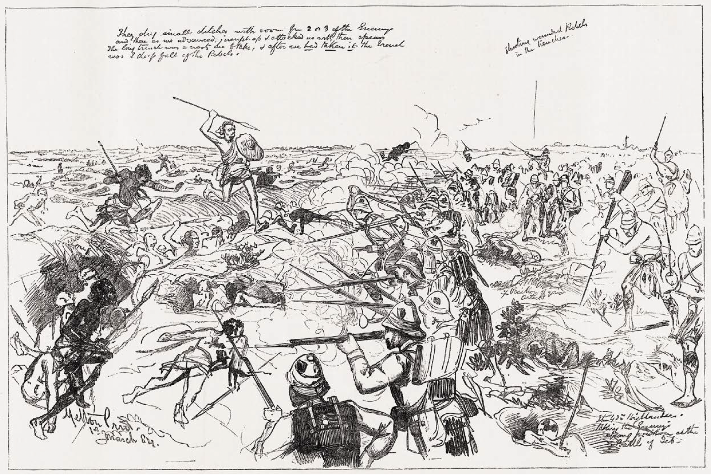
Melton Prior: The War in the Soudan: Battle of El-Teb, Aus: The Illustrated London News, 22 March 1884
“Special artist” Melton Prior covered 24 colonial wars. Over the years, the jingoist reporter developed a dynamic, sketchy style that anticipated the ability of the instant camera to record action. Prior’s ethos of authenticity implied that the content of some of his drawings unintentionally played into the hands of colonial critics, such as this depiction of a combat between British troops and followers of the Islamist Mahdi, which shows British soldiers bayoneting wounded Mahdists in the trenches. It led to a heated debate in the British Parliament.
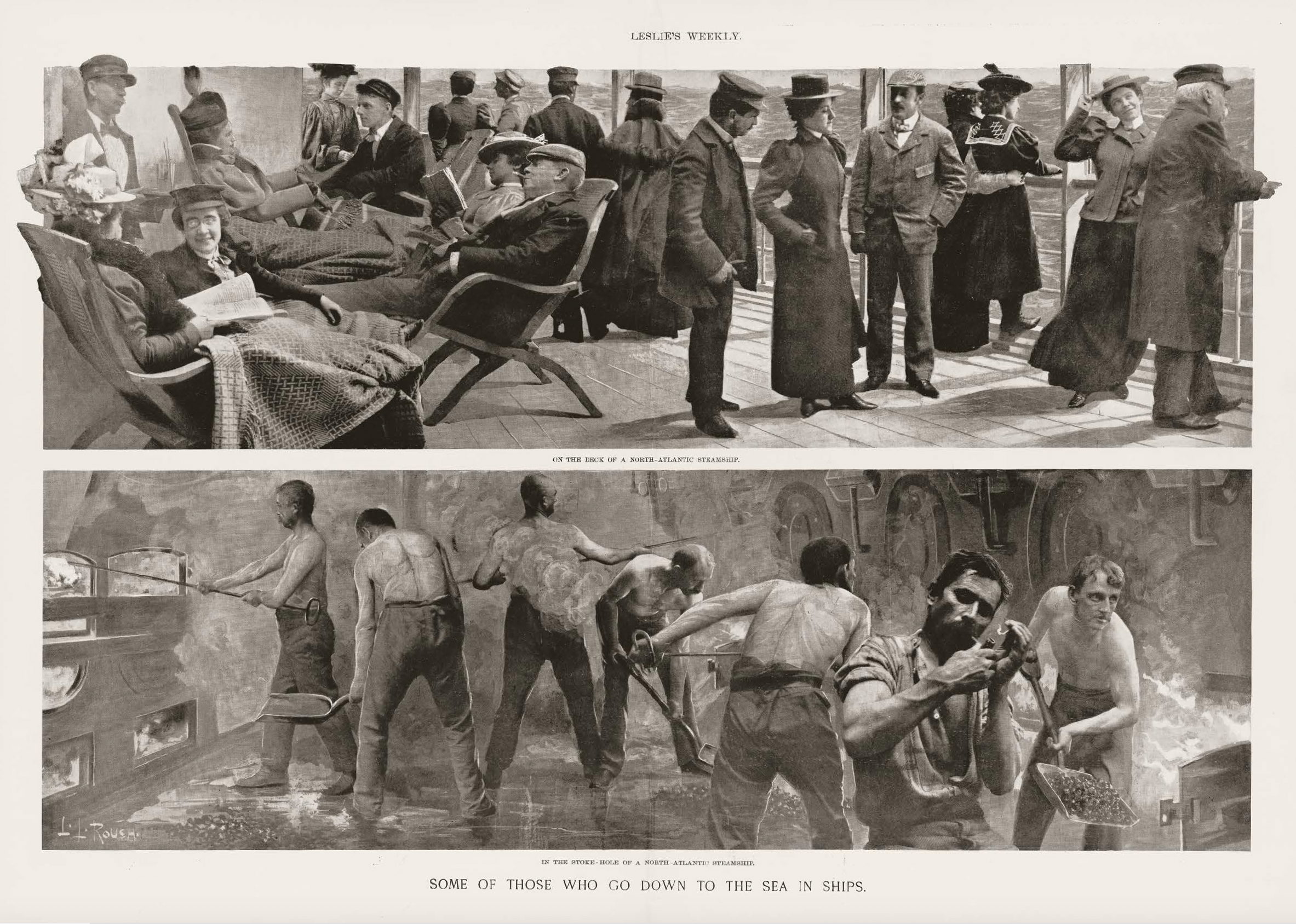
L.L. Roush: Some of Those Who Go down to the Sea in Ships, Aus: Leslie’s Weekly, New York, 19 August 1897
John Heartfield and Sergei Eisenstein are remembered as protagonists of the critical montage, but no one knows their predecessor L.L. Roush today. Yet his series of double-page montages for the American illustrated magazine Leslie’s Weekly and for Joseph Pulitzer’s New York World were quite popular for a time. The striking depiction of a two-class society on board a luxury liner also appeared in a widely circulated European magazine.
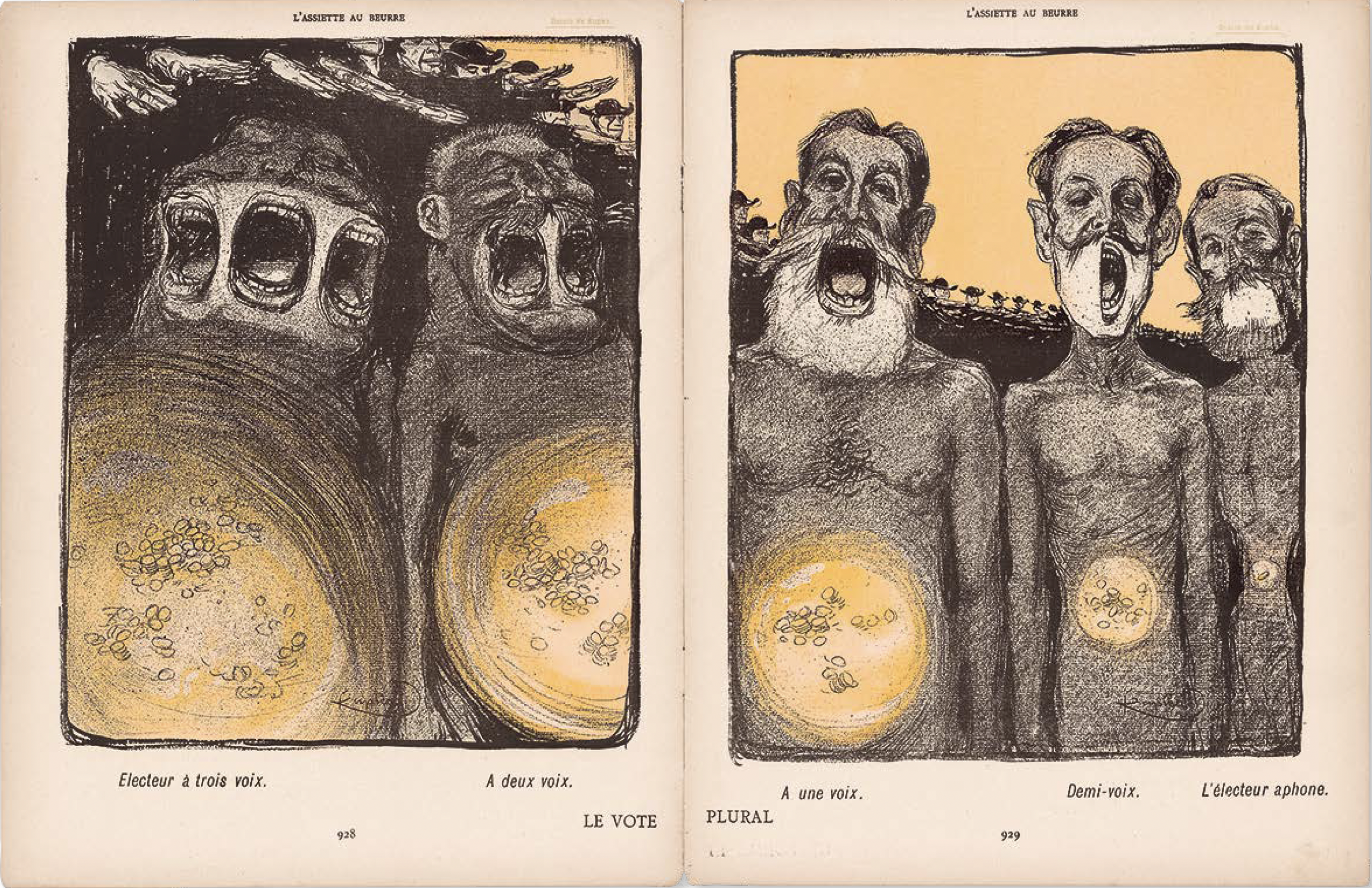
František Kupka: Le Vote plural, Aus: L’Assiette au Beurre, Paris, 3 May 1902
With his weekly satirical magazine L’Assiette au Beurre, the publisher Samuel-Sigismond Schwarz offered Parisian illustrators, among them many artists from the avant-garde Montmartre scene, a unique field of experimentation and a huge a platform for their anarchist views. Many issues were authors’ editions, which had no text other than the captions. It is difficult to imagine that such radical artists productions – here an example of the illustrator and later founding figure of abstract painting, František Kupka – were printed in huge editions of 40,000 to 250,000 copies and were influential in North America, as well as in Russia and the Islamic world.